watched.
Cofounder · Personal projectCase 5 of 5
How can people express what they really think of a film or show, without ranking it feeling like work?
- Contribution
- Cofounder. My contributions span research, product and interaction design, and front-end work.
- Team
- Two longtime friends as technical cofounders, responsible for substantial backend and recommendation-system work
- Timeline
- 2025 to 2026
- Outcome Launched, now paused
- A movie and TV tracking and discovery app that launched on the App Store. Its latest release describes a pause, with tracking and social features offline and users’ data preserved.

A problem we shared
My friends and I watched a lot of films and television, and choosing what to watch next kept becoming a problem. Recommendations often felt repetitive, or had little to do with our taste. We co-founded watched. to explore a more personal way to track what we’d seen, say what we thought of it, and find something new.
My part in the team
My contributions span research, product and interaction design, and front-end work. My cofounders took substantial responsibility for backend engineering and the recommendation system. The product was genuinely collaborative, so this case describes two questions the team worked through together, without dividing credit for each decision: how preference is captured, and how a recommendation explains itself.
Capturing relative taste
Stars are ambiguous. Two people’s three stars rarely mean the same thing. watched. starts with a broad choice instead: Liked, Meh or Disliked. Within that bucket, you compare titles and choose the one you preferred. Those choices build an ordered history of your taste.
Two films can both be liked and still sit in very different places in someone’s preferences. The design question is how much of that detail to ask for. More comparisons give richer preference data, but every comparison asks for effort. Our own planning named that tension; whether ranking feels effortless is something to test, not assume.
Making recommendations understandable
People questioned recommendations when they couldn’t follow the reasoning. So a suggestion carries its reason with it, connecting a title to specific things you’ve liked. An explanation has to give someone enough context to judge the recommendation for themselves.
Where it stands
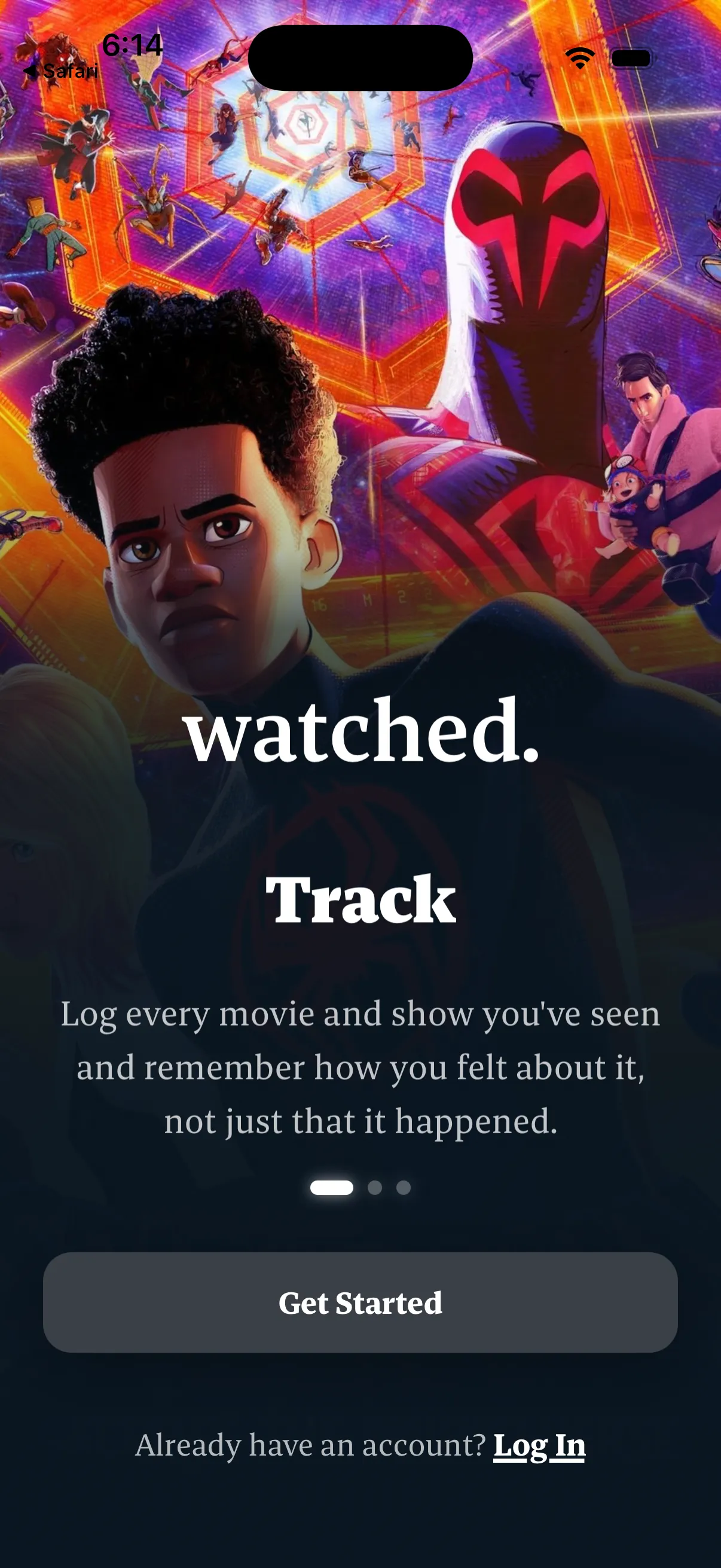
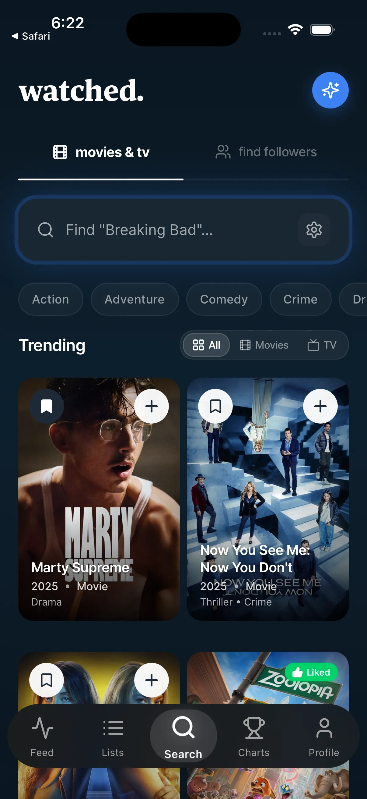
watched. launched, and its latest App Store release describes a pause: tracking and social features are temporarily unavailable, and users’ ratings, lists and profiles are being kept. These screens are from the App Store listing, so they show the product as it was, not something you can use today.
What the evidence shows, and what it can’t
Shows
- How the product captures relative taste: a broad bucket first, then a choice between titles.
- Why the product explains its recommendations.
- The areas I contributed to in a three-person founding team.
Can’t show
- That comparisons are free of bias, or that the recommendations are more accurate than others.
- Traction or retention numbers.
- Why the project paused, or when it might return.
- Which of these product decisions were mine alone. The work was shared.
Status Launched project · currently paused